Landing Page Service (LPS)

Design Strategy | UX | UI
This case study details how I drove the evolution of a simple SEO page builder into a service that builds major pages on our site, enabling our new business strategy to drive known users and loyalty.

What is LPS?

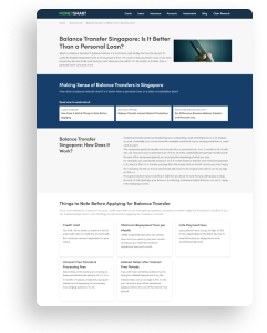
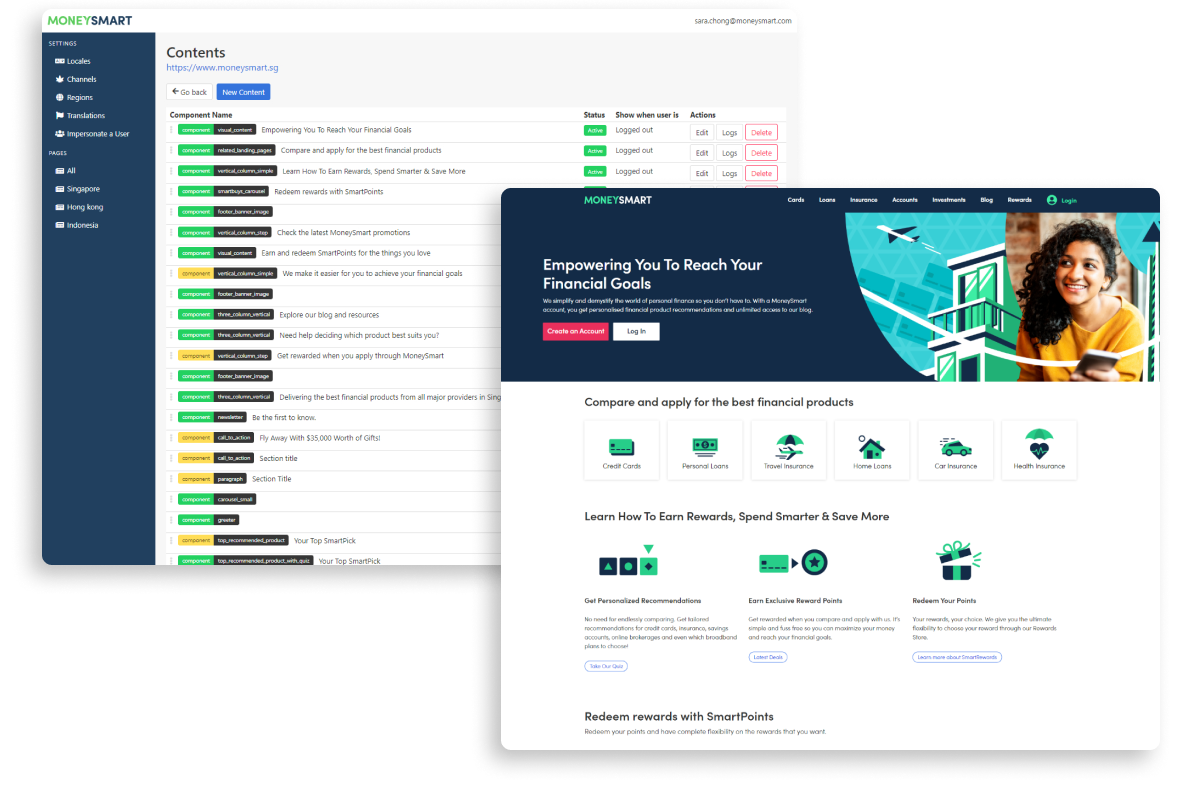
It’s a no-code (almost) internal page builder, made up of a mix of dynamic and editable components.The SEO marketing team were the main users of this service, but no one really owned the product itself. Having been on the marketing team working on this service when I was a Brand design Lead, I was deeply invested in the development of this product because of its potential for efficient scaling.

When I became Head of Design in 2022, I quickly assumed ownership over LPS.

The Evolution of LPS

VERSION 1: 2017-2019

SEO Page Builder

Created initially as a tool for the SEO team to churn out huge volumes of content pages for SEO.
  • What was Good: Boosted our SEO massively across multiple topics.
  • What was Bad: Pages were terrible, word-intense experiences causing high bounce rates and very short time-on-page.
VERSION 2: 2019-2021

Content Design

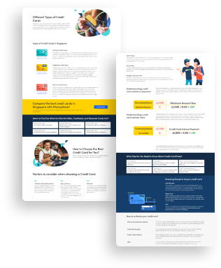
High bounce rates from these SEO pages led to a push to improve readability and deeper navigation. As a content designer, I worked with the product team to ensure more components were added to allow flexibility for images and video.
  • What was Good: LPS could now be used for high level navigation pages. Used by the marketing design team for campaign pages and educational content hubs, which were added to our media business packages.
  • What was Bad: Pages were pretty static, and required a lot of manual work. This was especially the case for Hong Kong, which had 2 languages
VERSION 3: 2022 - Current

Page Builder for Dynamic, Personalized Pages

This is where I took over as Head of Design and assumed ownership of the product, and used it to support multiple new initiatives.

I will cover how I drove evolution of LPS into this form in this case study.

The Larger Problem at Hand

Before I dive deeper into LPS, we need to look at the larger business and customer issues at play that ultimately led to the evolution of LPS.

Business Problem

Transactional customers, rising acquisition costs.
As the world of marketing shifted into a cookie-less era, (eg. new privacy locks from Apple and the impact on Facebook ads) the cost of acquiring transactional customers without owning them was becoming increasingly unsustainable to the business.

Customer Problem

Users had no real reason to create an account with us.
Users would come to MoneySmart to compare or read content about financial products. Moreover, any friction walls preventing this comparison or reading behaviour through sign-ups would lead to a notable drop in actions, which the Commercial team was not comfortable in facing.
Offer users a highly personalized and rewarding experience for their personal finance journey that builds with loyalty in exchange for creating an account.

Product Strategy

We needed to build 3 ecosystems over the next few years:
Customer profiling and product management system
Product and content recommendation system
A loyalty system that rewards users for retention

Objective

  • Increase number of sign ups
  • Increase number of profiled users

Factors for Success

  • All 3 systems (and their features) had to be present and seamlessly connected across the site for them to work.
  • These systems would need to scale across the site rapidly, which meant tech effort had to be efficiently used.

Solution at Scale:
Build features and components made for LPS

Each of these systems would require far-reaching features that could be easily implemented across the site for scale. I saw this as an opportunity to kill many birds with one stone by leveraging LPS’ no-code scalability:

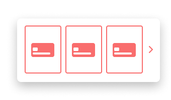
Re-usable recommendation and profiling components in LPS

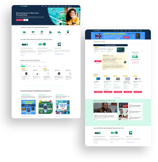
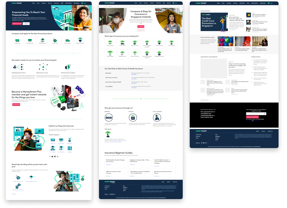
These could be added to any LPS page on the site, including the Home Page and top level navigation pages like the Insurance or Loans pages.

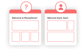
Authentication-aware functionality for all LPS pages

LPS pages were currently static, and unable to react or change depending on a user’s authentication status.

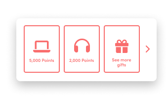
Dynamic reward store components for LPS for logged-out users

The loyalty Reward Store itself was locked away in the user dashboard, which meant non-signed up users couldn’t preview their potential redemption rewards.

Working through this Solution

PART ONE

Create re-usable components that recommend products and content across our site

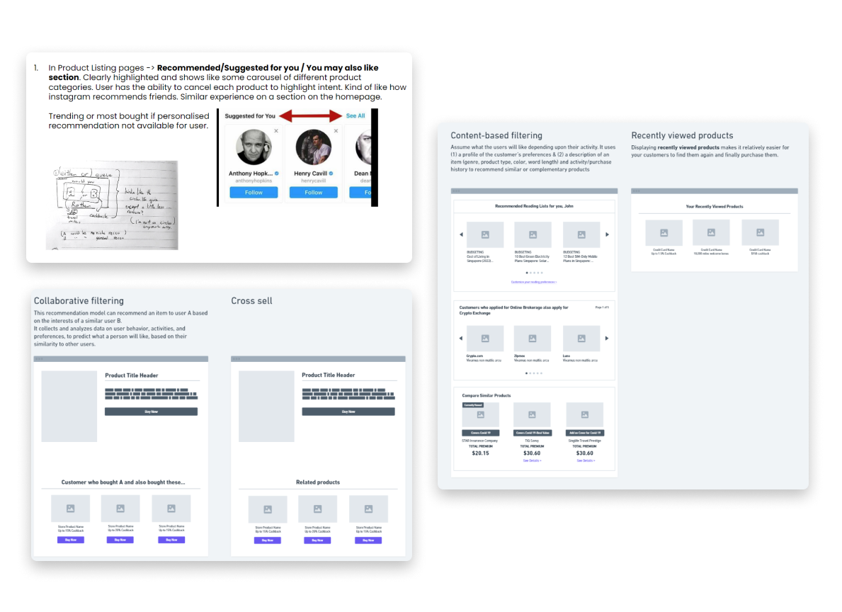
With our personalization strategy worked out, I collaborated with a Senior Product Manager to run a few cross-functional workshops to ideate how we might introduce product recommendations across our site.

While there were various places in our ecosystem that could have features showcasing recommended products, the teams also saw the need for a single “home” for a user to see all their recommendations based on their user profile.
Focusing on the Home Page
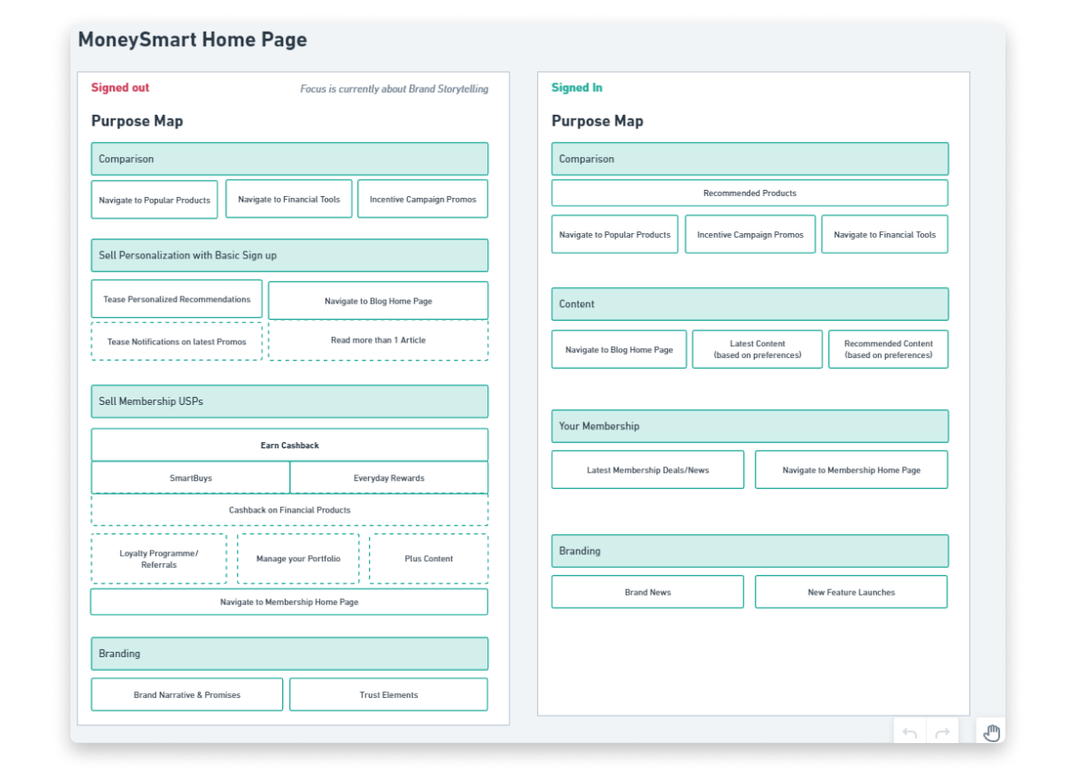
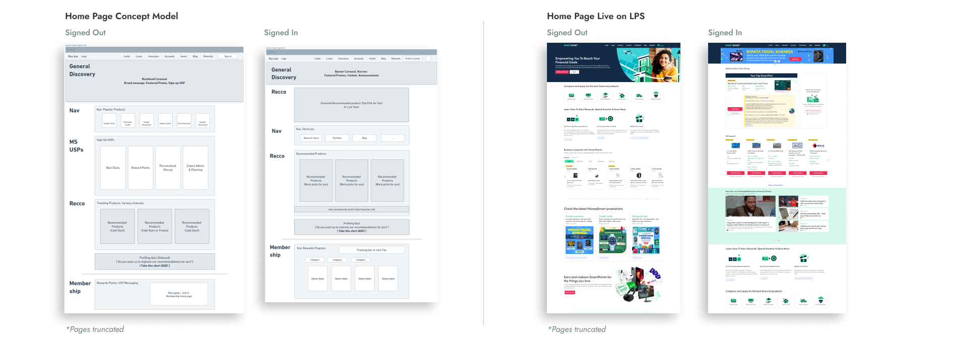
Both the Senior Product Manager and I determined that the most straightforward “home” should be the site’s Home Page, which would set a conceptual precedent for every page beyond that point being personalized to a user. I designed a concept model for the Home Page to illustrate this.

This required some debate and negotiation with the Head of Product, who felt that we should instead create a separate hub page that leveraged marketing for discovery. I saw this as a waste of marketing dollars on top of an overcomplication of the user flow, and this convinced him to green light the update on the home page.
Product Recommendations brainstorm
Home Page Purpose Map
However, the home page was built on LPS, which did not have the ability to change to reflect a different experience depending on a user’s authentication status.
PART TWO

Driving LPS upgrades to solve multiple problems at scale

After hitting the first technical issue because of LPS’ inability to change page content depending on a user’s authentication status, I dug deeper into LPS and how it related to our core customer problem: Users have no reason to sign up or log in on our site.

Addressing the Customer Problem

Many pages and experiences remained exactly the same whether or not you were signed in.

These pages included:
  • Home Page
  • Educational, Guide Pages
  • High level navigation pages
These pages were all built on LPS.

There was only one area that recognized if a user was signed in:
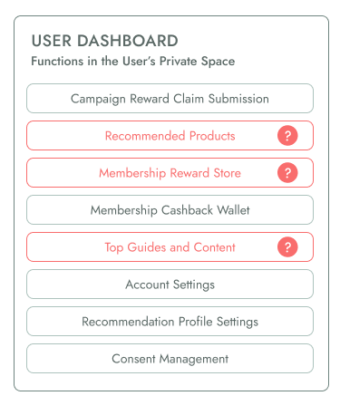
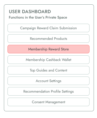
The user dashboard.

This was getting crowded with features the team wanted to lock behind the “log-in wall” even if it made little sense to hide these features in this space.

The Solution

I presented the solution to enable logged-in and logged-out features in LPS as a whole, so that all existing and future pages could have different personalized experiences. Alongside this, I proposed new concept models and content design for landmark pages running on LPS for logged in users.
With this capability built, I was then able to design and build reusable LPS components that:
  • Showed product recommendations
  • Were widgets for users to update their profile for better recommendations.
This meant fully differentiated experiences for logged in users, including introducing SmartPicks (product recommendations) to the home page experience.
PART THREE

Helping users discover the benefits of SmartRewards

Parallel to the work in product recommendations, I was also leading design in another workstream that was working on the Rewards ecosystem. Through a small set of user interviews conducted by our Design Lead, we learned that directly showing users what we had on offer in the store was integral to them gaining interest in the Rewards programme and signing up on MoneySmart.

The Problem

The first version of the Rewards Store was built before I took over as Head of Design, and was locked in the user dashboard, that could only be accessed if a user was signed in.

Users had no way to preview all the items they could redeem in the store without creating an account, which made advertising the store incredibly manual, and required marketing creatives.
Creating a version that didn’t require users to log in would involve high tech cost, so we needed a creative, automated way to show off what we had in an ever-changing store without changing where the Store was in our ecosystem.

The Solution

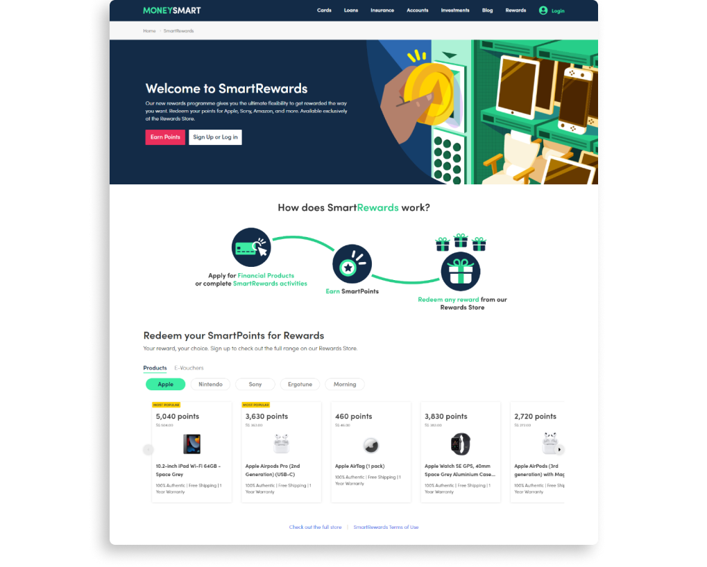
Now that LPS pages could be built with logged in and logged out views, I proposed and worked with my Design Lead to:
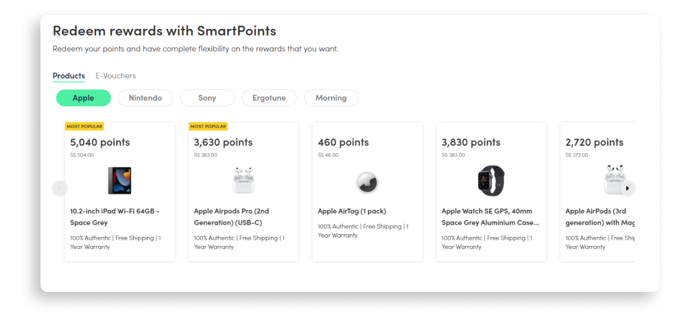
Build an LPS component that showed our store items, which could be repurposed elsewhere on the site.
Hi-Fi by Jules Ang, Design Lead
I could then use this to create logged-out pages on LPS where users could discover our new features such as Rewards, and the benefits of signing up.

Outcomes from redesigning LPS

  • Increasing the visibility and access to our signed-in perks helped us achieve our goals to increase the number of signed up users by 4.2x and profiled users by 2.6x from the start of these initiatives.
  • Enabling authentication-aware capabilities on LPS now opens up the new possibility for improvements to other LPS pages that could benefit from having authentication aware states. Moreover, these pages can be built and maintained by non-tech internal users for quick tests due to the no-code page builder nature of LPS.
As we iterate in the coming years, our redefined use of LPS has shifted our perspective.
It's no longer just for content and SEO; it's a tool for crafting, modifying, and testing new, authentication-differentiated experiences throughout our ecosystem at scale.