AI-Powered Financial Advice

Design Strategy | UX | UI
Designing a new experience that leverages the power of AI and its developments to support the user in making smart financial decisions more quickly.

I played many roles in this project due to the lean team size. This case study will take you through how I worked through end-to-end design in this initiative:
  • Developing the strategy and framework for how AI supports our experience vision
  • Obtaining buy-in from stakeholders to conduct a 6-month experiment
  • Planning research and design activities, and aligning the wider team on the roadmap
  • Executing the design process from research, ideation, to creating hi-fi designs for tech handoff
  • Planning future iterations and further experiments beyond 6 months

The AI landscape when we started in Jun 2023

  • Chat GPT 4 and AI chatbot services like Dante.AI were emerging
  • GPT was unable to search the current web, which meant that much of its time-sensitive financial data was either hidden or outdated.
This initiative started as a push by our CPO to be part of the zeitgeist, lest we get left behind as a business.
Together with the Head of Product, I designed an experience strategy that would not simply incorporate generative AI for the sake of it, but rather as a means to solve long-standing problems with our experience.

What Problem did we need to solve?

Customer Problem

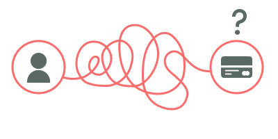
Shopping for the right financial product is annoying. Research is time consuming and comparing choices feel like work.
The financial industry is notoriously opaque and jargon-ridden, making it difficult for people to find the right product for their needs. Most people simply settle for products that are either too expensive, or don’t get the most out of the products they’ve applied for.

MoneySmart is on a mission to solve this problem.

Product Problem

Our MoneySmart experience was packed with financial resources, but fell short in two key areas:
  • Users are overwhelmed by choices without clear guidance on what's best for them.
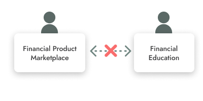
  • A disconnected user journey - those who use the educational resources aren't effectively using the product comparisons, and vice versa. Essentially, users weren’t getting the full benefit of what we offer due to a lack of integrated advice and a cohesive user experience.
Despite being painfully aware of these problems for years, we did not address this gnawing issue over the years due to Commercial priorities and the small size of the Product team.

Developing the Strategy

Create a seamless, contained financial advisory experience with AI that draws from the vast quantity of financial knowledge and data we own through years of partnership with financial institutions and expertise.
This experience should be easily embedded alongside both the Financial Product marketplace and in Financial education spaces. Users would then be able to use such features to research, compare and achieve their financial goals in one single experience.

An Experience Framework to layout this concept

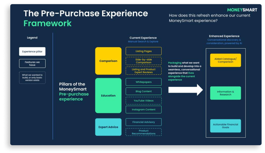
I created a framework to conceptualize and communicate how we would consolidate all the capabilities we wanted to build (as separate features) into one single experience with AI, which we used as our starting point for the now-called “AI Experiment”.
Mapping the new AI experience to previously desired upgrades

Visualizing what this Experience might look like

To illustrate to the Exco and others working on the proposal what potential forms this single experience could take on, I created a series of explorations referencing newly emerging AI experiences.

In my explorations, I considered the following patterns for full-screen and embedded experiences that served the persona of “The Financial Advisor” we needed:
  • Chatbot (eg. ChatGPT)
  • Smart search (eg. Google AI)
  • Co-pilot (eg. Microsoft Office)
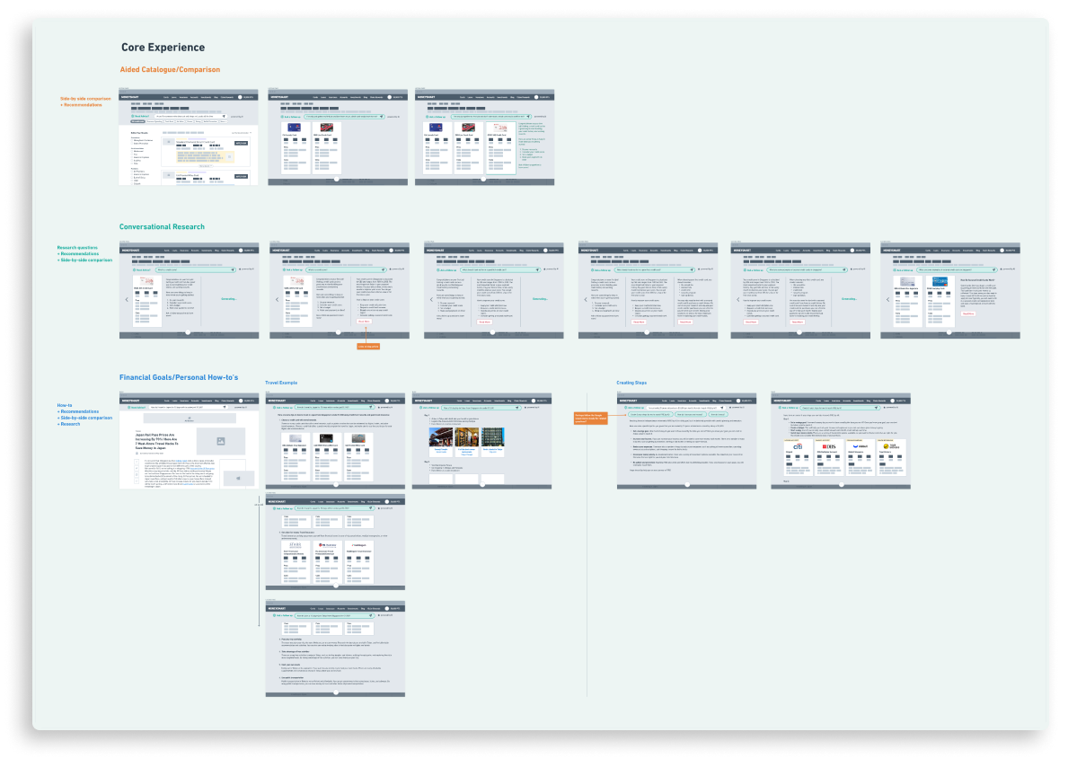
Experience explorations based on purpose
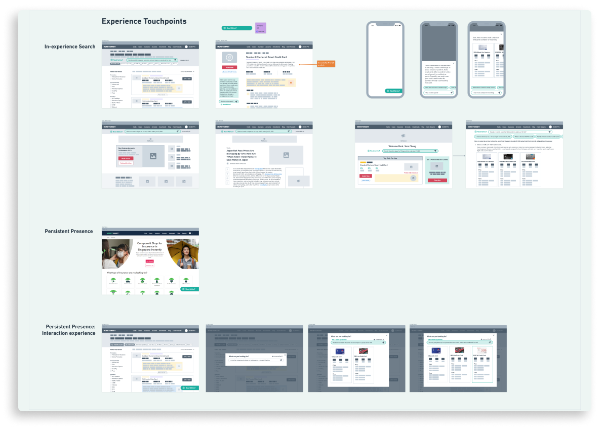
Entry point explorations

Focusing the proposal for actionability

I then explored various User stories from our multiple product offerings that would meet the following criteria:
  • Short Journey length (e.g. Products like mortgage have a multi-month customer cycle, and it would take too long for us to attain results.)
  • Low Customer Risk (e.g. It would have been too risky to give experimental AI advice on Life Insurance)
  • High Commercial Impact (i.e. Products where a small change in behaviour would translate to a proportionately large impact on our commercials)
Together with the Head of Product, we decided that we would tackle the credit card space, which was our core financial product offering and satisfied all 4 factors.

The Experiment

We would create an AI-powered financial advisor bot experience that would enable users in researching, comparing and applying for credit cards.

This experience would offer a highly effective a shortcut to finding the right card without having to manually compare hundreds of credit card offerings on our listing pages.

The Team

Because this was such an unknown space with exciting potential, the heads of product, tech and myself (design) decided we would all lead the experiment together with borrowed support from our respective teams.

Objective

To make the most of our very limited resources, it was essential that we planned our Experiment carefully to achieve results that indicated commercial potential through this improved experience.
  • Positive or no change in conversions on credit card listing pages, which would offer the AI-supported experience alongside the existing listing page.
  • Increasing proportion of users converting through the AI experience vs. the current credit card listing page.
  • Test at least 3 POCs (Proof of Concept) in 6 months

Planning a clear approach

There was a fair amount of nervousness from the product and design teams in how to approach this daunting blank canvas that was unlike anything we had worked on before.

To bring clarity and confidence to the team, I designed our research and design plan for the next 6 months to guide our small, part-time team and set clear expectations, which is structured as follows:

3 Areas for Research and Exploration

User expectations vs. Bot behaviour

  • What do users look for when they’re researching, comparing and applying for credit cards?
  • What do users expect out of a financial advisor for credit cards?
  • How do credit card experts give advice on choosing credit cards?
  • How should we inform our prompt engineering?

Bot container format and entry points

  • How might we create the right signals for a user to intuitively understand how to use the bot for researching, comparing and applying for cards?
  • How might we create an experience that does not compete with our existing, highly-sensitive listing experience?

Components generated within the bot’s responses

  • How might we improve readability and ease of comparison in place of lengthy, text-only responses?
  • How might we design reusable components that the bot could generate for different response types?
  • How might we encourage a user to apply for a card directly in the bot experience after benefitting from research and comparison?

Researching User Expectations vs. Bot Behaviour

To build our domain knowledge of credit cards and AI experiences, I brought on a Senior Product Designer to assist me in conducting this research.
  • Desk Research
    Gathering and analysing features, functions, experiences and new user expectations from existing AI experiences. Constantly ongoing due to rapid developments in the generative AI space.
  • User behaviour and expectations research
    Due to a lack of research budget, we turned to credit card user survey insights previously conducted by our marketing research team. From this we gleaned insights on fears, concerns, priorities and attractions users had when it came to choosing credit cards.
  • Domain expert interviews
    To understand how an actual person might advise a user on getting the best credit cards, we conducted a series of expert interviews with our credit card account managers and content writers to understand their mental model.
  • Create credit card domain models
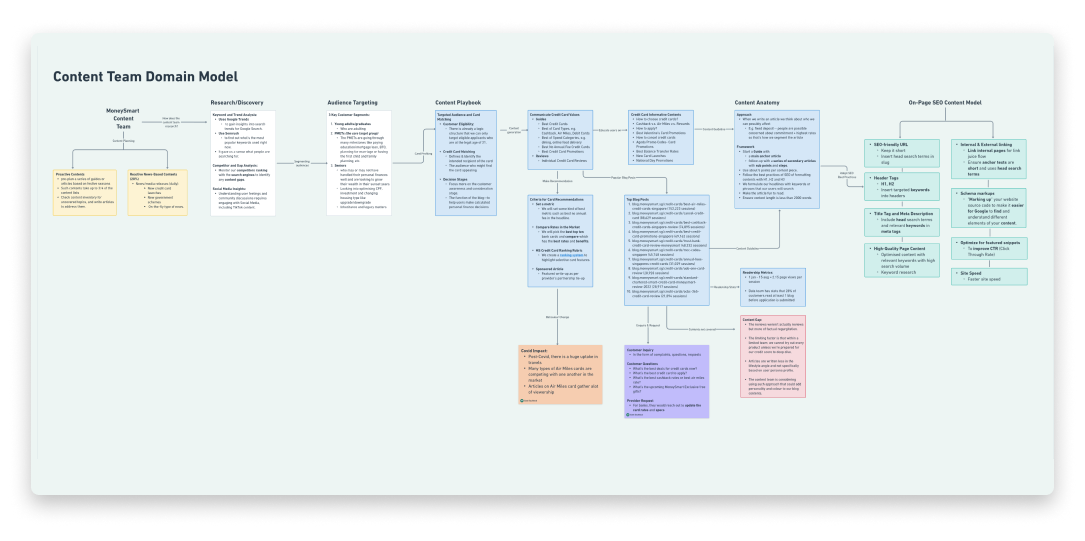
    From these two sets of activities, I requested the Senior Product designer create a domain model that would serve as an easy context-setting reference for the team and anyone onboarding on the initiative. They would contain key insights from the perspective of the user, content and commercial.
Domain models compiled by Seet Seahteai, Senior Product Designer

Creating a Design Testing Plan

Alongside design and research activities, the tech team were conducting tech explorations of their own. To align the full team to all the activities that would take place over 6 months, I created a Design Testing and Exploration plan that would align with Tech’s own testing plans and ambitions.

This would help Product managers, designers and developers understand what was expected of everyone at each stage of the experiment, and made it easier to communicate our activities to stakeholders and onlookers.

POC 1: Chatbot

While the previous activities were being carried out, the Product and Tech teams explored directly inserting a Chatbot in the listing page experience that was powered by Dante AI.

The team wanted to rapidly test how users might behave and query the chatbot in such a familiar format when placed alongside our product listings.

Objective

  • Gauge User interest in the AI Chatbot feature (Clicks and length of interactions)
  • Collect conversational data to determine User intentions and assumptions from the format

Insights and Outcomes

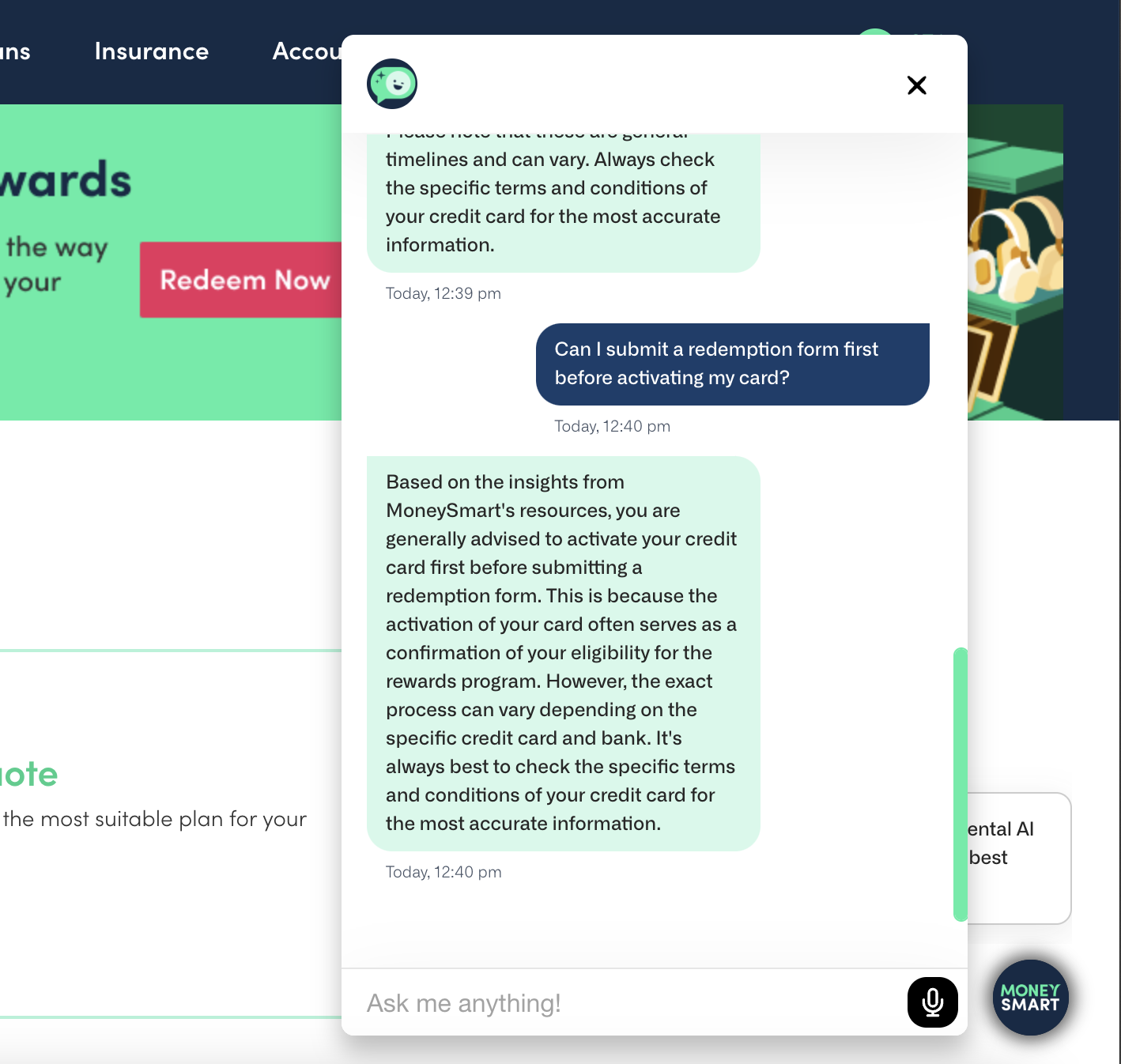
  • Users commonly assumed that the Chatbot was a customer service bot, and would ask questions about their incentive claims
  • Close monitoring on bot responses to customer queries allowed the team to make quick iterations on the bot’s prompt engineering, which would continue to evolve regardless of bot format.

POC 2: Search Bar

Testing an alternate, yet familiar format for the AI chat entry point. The chat behaviour itself would be the same as the Dante AI experience, but presented in the form of a search bar like Google and ChatGPT.

Objective

  • Gauge User interest in the AI Search Bar Chat feature (Clicks and length of interactions)
  • Collect conversational data to determine User intentions and assumptions from the format
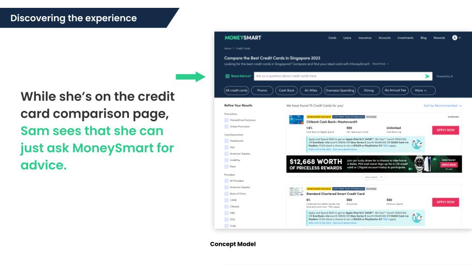
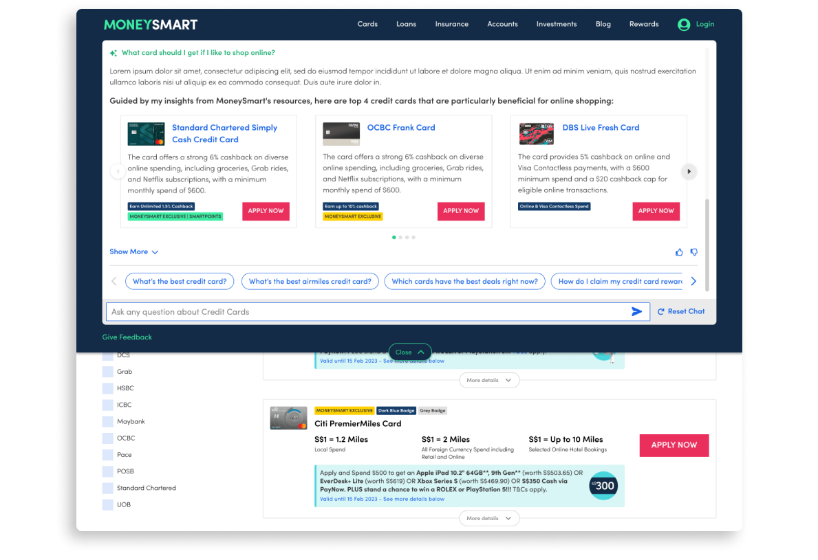
Adding a Search bar prominently in the Listing page masthead

Design

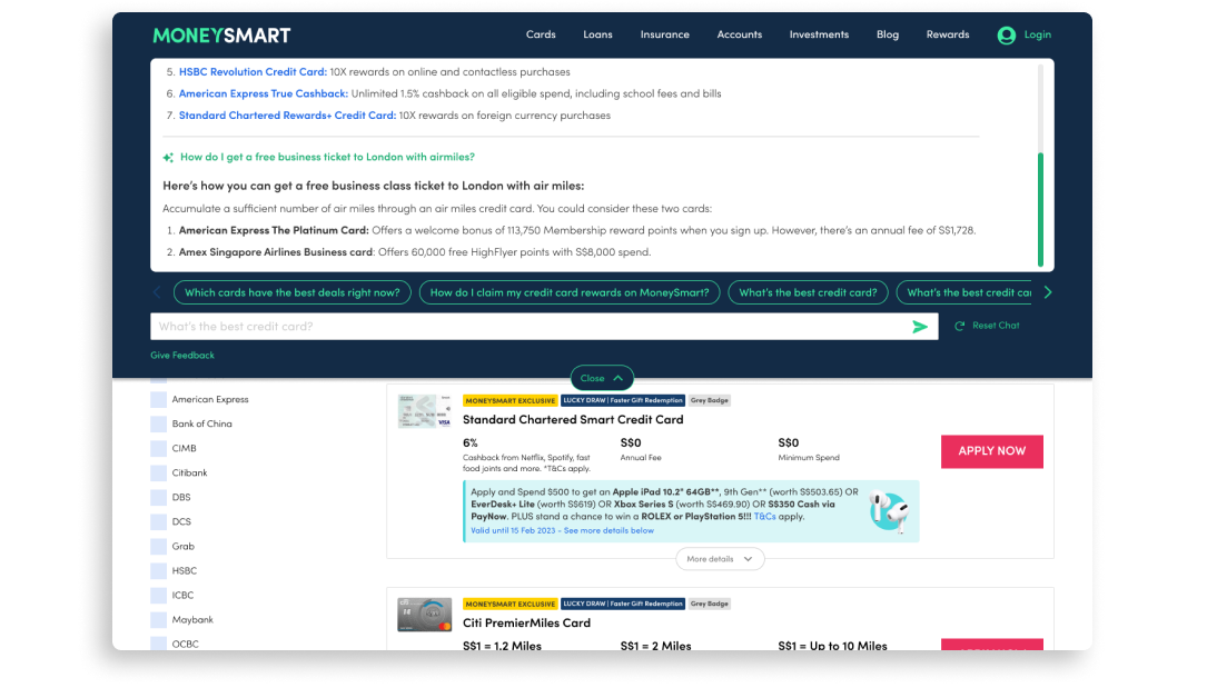
The intention of this test was to gauge the difference in user behaviour and interest when initially presented with a Search bar vs. a Chatbot, so we kept the internal experience somewhat similar to the first Chatbot test, which also provided text-only responses.

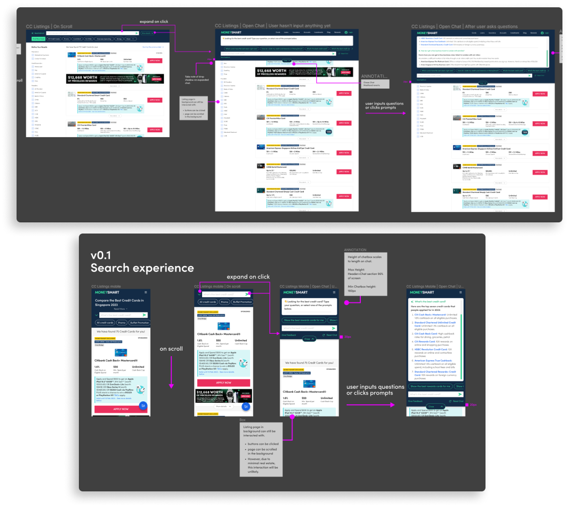
To get this test out as quickly as a follow up to the Chatbot test, I based the final Dev-ready designs for the test on the mock ups from my initial pitch, with adjustments for actual application.
Dev - ready Design
Mock up from Pitch

Iterations

When the designs were built on our Staging platform and in QA, we sought qualitative feedback on the UI from our co-workers from our neighbouring business unit and others who had never seen anything to do with the initiative.

It was determined that:
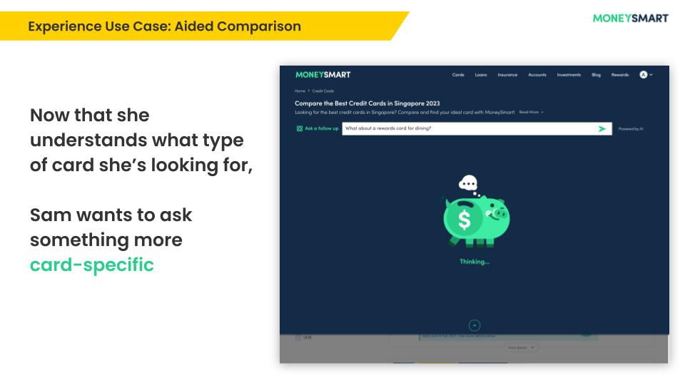
  • The position of the chat input and prompts felt unintuitive and disconnected from the chat responses, as it did not match the flow of regular chat UI. This initial design was borne of the assumption that as a Search bar, one would expect results to present under the bar rather than above it, similar to search engines.
  • Users felt the urge to reset the chat after a while, especially when they wanted to start a new line of queries on a fresh screen. This feature was not present at the time.
Based on this feedback, I made quick adjustments to the designs, which were implemented quickly by the developers for the live AB test.
New Iteration: Shifting the Chat input under the Chat responses

Insights and Outcomes

  • Users interacted more with this bot format, potentially due to its increased visual prominence.
  • Users started treating the bot like a search bar for research and searching for brands of credit cards they were interested in, and we saw a decrease in users trying to ask customer service questions.
  • Close monitoring on bot responses to customer queries continued, allowed the team to make further iterations on the bot’s prompt engineering.
The conversion rate for the listing page increased for desktop, but decreased on mobile with this variant.

I hypothesized that this was caused by two things:
  • The experience did not allow a user to apply for cards in chat responses. When presented with card options, the user may only click out to a Product detail page where they might apply for the card. This adds an additional click to convert compared to the existing listing experience that allows for immediate applications.
  • The mobile variant presents as a full-screen take over, hiding the listing page underneath it. This is less of a problem in the desktop variant, where the listing page is visible alongside the chat experience.

Next Actions

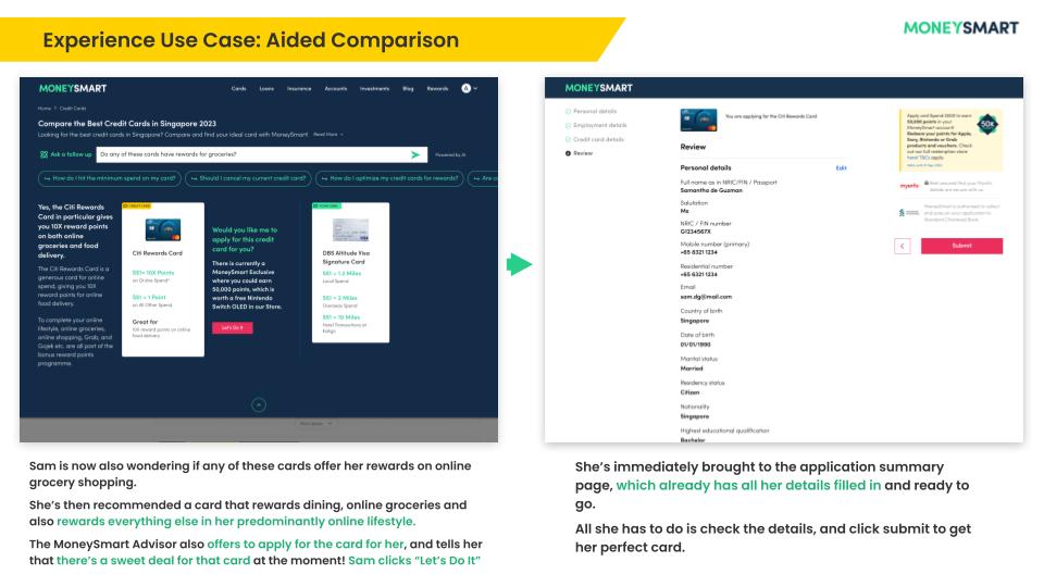
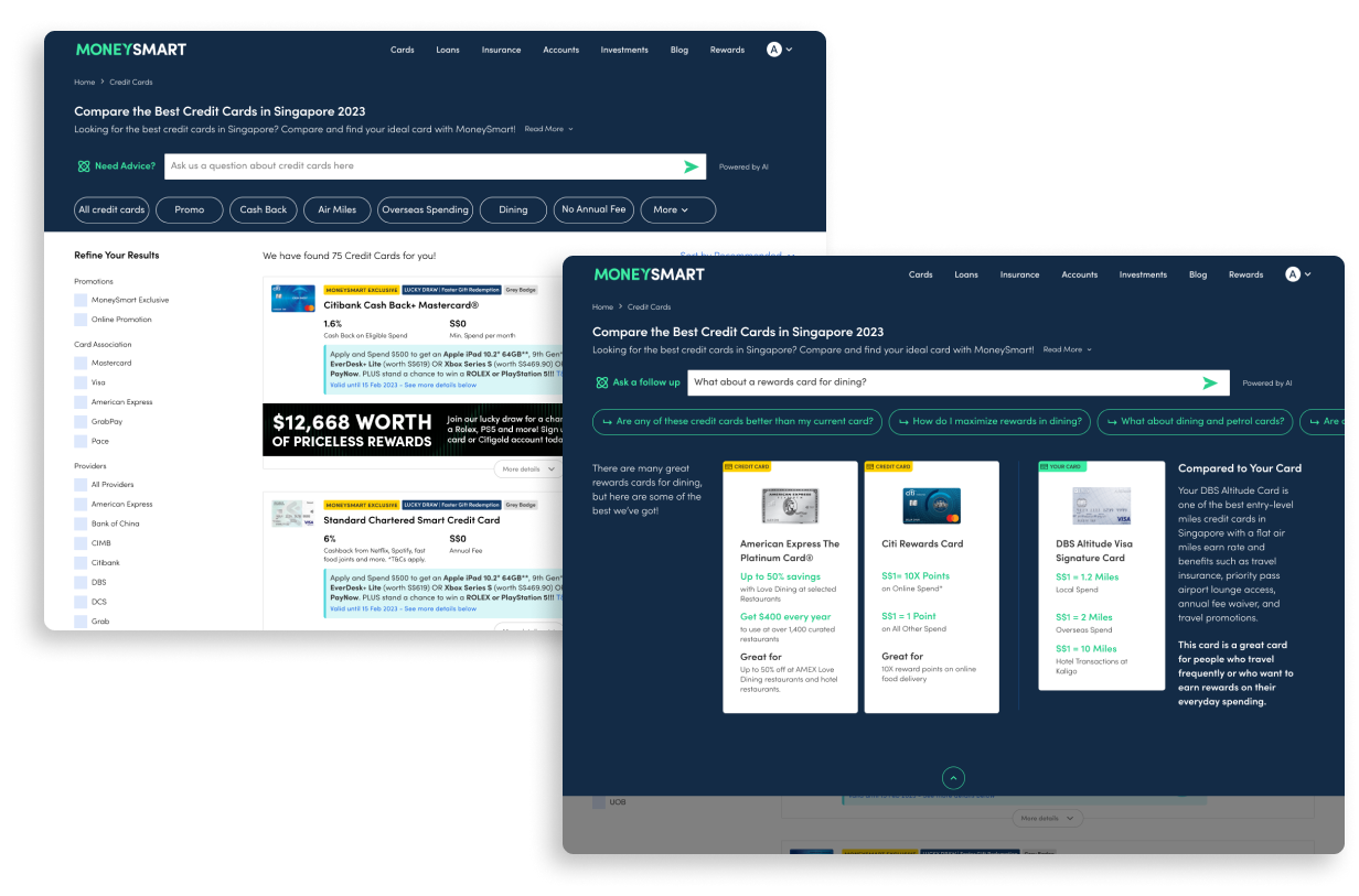
Proceed with POC 3, where we create content components to be generated in bot responses that presents easy interactions that allow a user to apply for cards, and compare card details easily.

POC 3: Search Bar with Interactive Content

While the POC 2 test was running and insights gathered, we got to work on designing reusable components in preparation for POC 3.

Objective

  • Increase conversion rate for credit cards in both desktop and mobile variants of the Search Bar Chat experience.
  • Collect conversational data to determine User intentions and assumptions from the format

Ideation

At this stage of the Experiment, I wanted to not just explore new components we knew we needed, but also set us up for future iterations beyond the 6 month experiment. I ran ideation sessions with the Senior Product manager in charge of the AI experiment, the Senior Product Designer supporting me from the start, and a Senior Marketing designer whose area of expertise was content design to gather and refine a broad collection of ideas.

We would explore 2 areas:

AI-powered Components and Snippets

Besides being generated in chat responses, components explored could also be repurposed as standalone AI-powered features elsewhere in our site experience.

Bot universal UI

Based on common features seen in Bing and ChatGPT, I saw the need to evolve our basic chat experience to eventually include more complex features to meet baseline user expectations in the long run. These included concurrent conversational threads, conversation history, and profile customization, amongst others.
Because we were all “part-time” on this Experiment, I created shared Whimsical boards we could update within blocks of days when we had time, before regrouping for shorter ideation and refinement meetings.
HiFi Design

After aligning with the team on the final set of components we would create, I handed the LoFi designs off to the Senior Product Designer who translated them into Dev-ready designs.
Hi-Fi design by Senior Designer, Seet Seahteai

Next Actions

With this being potentially the last POC in the 6 month experiment, we have finally secured some budget to run user interviews to gather qualitative insights on this POC alongside our quantitative data.

At time of writing, this Experiment is still ongoing, and POC 3 is still running as an AB test.

Key Learnings

  • It is incredibly easy to forgo qualitative feedback on designs in rapid testing when time is short and resources lean. Considering how new this experience has been for all of us, any user feedback we received during the course of this experiment has provided us with much needed guidance and insight for the next experimental direction. Without which, all we would have been doing was throwing mud blindly at a wall in the hope that something sticks.
  • Spending time to lay out clear plans and processes, even when time is short saves more time by skipping problems caused by siloed work, panic-working and misalignments.