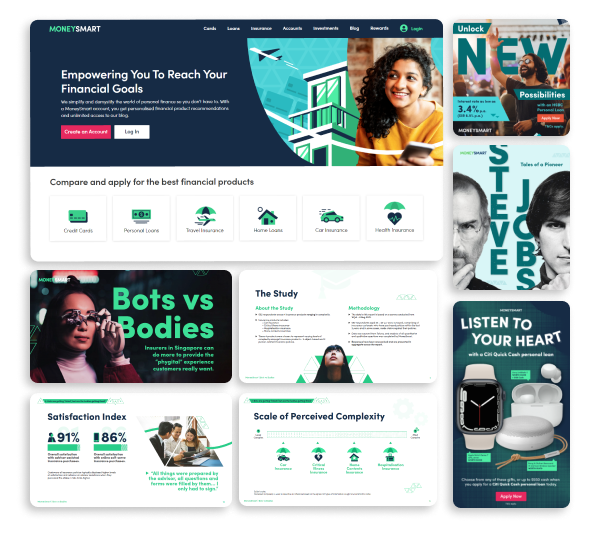
Brand Refresh:
Building a distinct visual identity

Design Strategy | Brand Design
When I took over as Brand design Lead in 2020, I worked together with the Head of Brand, who had spent the last year researching the market and our brand positioning in Singapore, to begin a much needed Brand refresh.

Why do a Brand Refresh?

Lack of Market resonance

Based on the extensive research carried out by the Head of Brand and his team, they determined that Customers in the finance space cared about 3 main things:
  • Financial Independence
  • Personal Progress at their pace
  • Peace of Mind
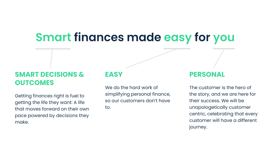
With these 3 points, he crafted a new brand promise to match what customers cared about.
"Smart finances made easy for you."
A new brand promise meant that I needed to audit and review our visual design language and experience to determine how it might express this promise more obviously and clearly.

Degrading design consistency and visual brand distinction

The team did not have a shared ethos or guiding principles to evolve and scale the brand, and this lack of brand design logic led to a couple of problems:
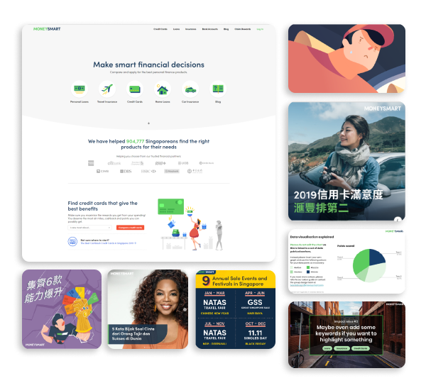
  • Marketing campaigns in MoneySmart are 90% run in partnership with banks and financial institutions, to promote their products. Because of these partnerships, campaign designs were often pushed into adopting partner brand styles, essentially erasing the MoneySmart brand in our marketing.
  • Our brand elements were largely superficial, lacking grounding in audience resonance and a clear, cohesive expression.
  • There was little official collaboration between the brand design and product design teams. This created a disjointed experience where marketing material would express the brand in one way, and the MoneySmart site experience was brand consistent only in colours and typefaces.
  • Evolving the brand for scale without clear brand logic and design principles was disastrous, and often led to clashes of personal preferences.

Brand Consistency Test

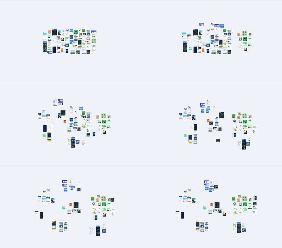
To test my hunch that our brand was not consistent or distinct, I engaged the research team to design a brand consistency test with a panel of interviewees.

Method

Card sorting and thinking out loud with 5 visual cards each from 5 different brands with logos removed, including MoneySmart. This was inclusive of:
  • Examples of marketing, socials and site screenshots
  • Competitor brands
  • Well-known house brands

Measurements

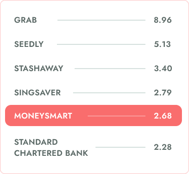
  • Brand consistency score as a measure of brand distinctiveness (a metric based on number of cards matched together in the same brand)
  • Qualitative insights on brand perception

Insights

Low consistency score

MoneySmart needed to focus on having 1-2 strong branded elements

Dabbling too much in multiple styles and formats results in each item being more closely related to other brands that do that style more frequently

People think of MoneySmart as informative, simple breakdowns

People describe MoneySmart infographics as good summarised information and later describe MoneySmart similarly. One even mentioned that they recognized our humour. This bodes well for tackling at least one aspect of our brand promise: Making finance “easy”.

Designing a Visual Design Language

INSPIRE

Design Ethos

High level, inspirational concept that drives design.
ALIGN

Design Principles

Create guidelines for major facets of your brand. All elements should resonate with the Brand principles.Here are two most distinct changes we made to the new visual design language.

Financial decisions made easy

  • Break down complex financial concepts
  • Show the simplest path

Talking to the person in personal finance

  • Telling relatable stories, empathizing with you.
  • You are the hero of our story

Showing the outcomes of smart decisions

  • We show you what could be
  • We guide you towards making realistic decisions
EXECUTE

Design Playbook

Create guidelines for major facets of your brand. All elements should resonate with the Brand principles.Here are two most distinct changes we made to the new visual design language.
Colours
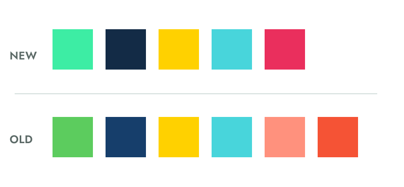
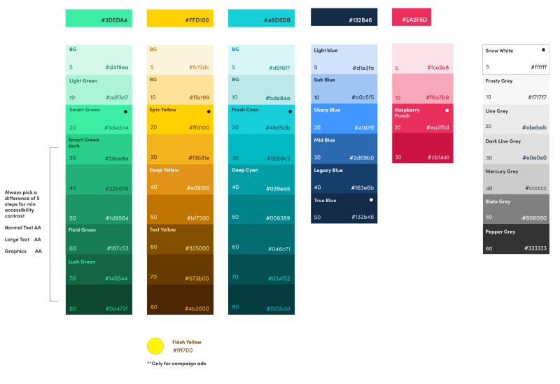
  • To modernize the brand and express the concept of “easy = clarity”, I adjusted the colour scheme towards a higher contrast, cooler range. This colour range would inject stronger contrasts in how we design and use our colours in creatives and on our site.
  • This was also adjusted for a stronger contrast range for our design system
Motifs
Create guidelines for major facets of your brand. All elements should resonate with the Brand principles.Here are two most distinct changes we made to the new visual design language.
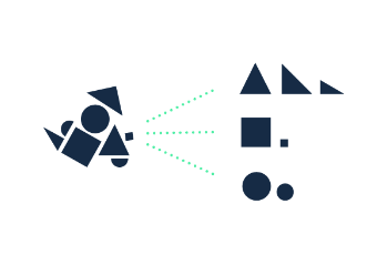
Triangle of Change
The triangle is a mathematical symbol of change. Money is change, and MoneySmart is the driver of your growth through change.
Paths
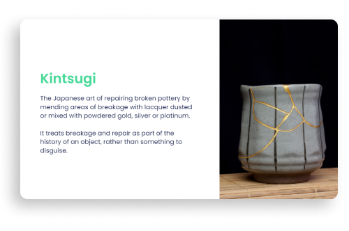
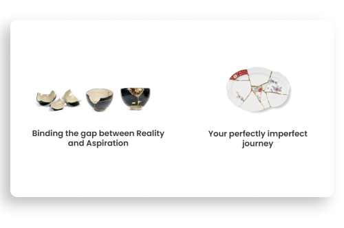
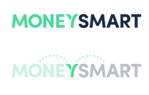
Resonating with our design ethos of the “imperfectly perfect journey”, and echoing our kintsugi inspiration, this mark already exists in the Y of our existing MoneySmart logo.

Communicating to the team

To rapidly disperse the thinking and logic behind the new brand direction to creatives across the organization, I created a short deck to outline the brand narrative and main themes of the new brand direction — this was called the Visual Design Language Playbook, which is a highly condensed form of a Brand Bible.
Why A Visual Design language playbook?
To align the team quickly on core narratives, used for onboarding new designers or as a quick introduction to the brand. With this short-form playbook, we could:

Design with Purpose

  • Removes personal subjectivity
  • Shared design logic

Maintain Consistency

  • Creative direction expands from the same origin
  • Everyone speaks the same language

Design for Scale

  • Easy to onboard new designers
  • Less time spent on reviews
  • Direction and boundaries for explorations
New Brand
Old Brand
EVOLVE

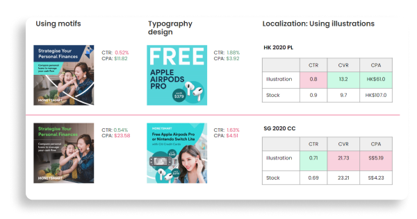
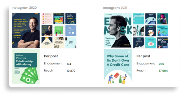
Learning Agenda

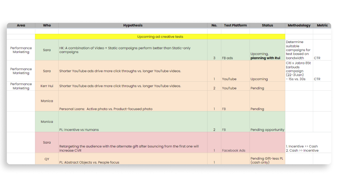
Now that the brand was ready, we put in place a Learning Agenda to test creatives and new elements we were using.

Design tests, share insights

Monthly meeting to plan design tests through campaigns and socials for the month or share insights

Cross-functional

Collaboration with the marketing team to test creatives on multiple platforms and channels

Feedback cycles

Constant evaluation of creative direction to improve our brand and keep up with an ever evolving marketing landscape
This method has since been used to test new styles and formats within our visual design language. By aligning designers through narrative, it’s given them the freedom to experiment with new styles and visuals, as long as it laddered back up to the core visual design language of our brand.